Jan 10, 2023
Ooh dear. It's OOH advertising.
Where are today's great OOH posters?
The high street is in a sad old state. Not only do we have to put up with hipster barber shops, dodgy nail bars and over-priced coffee shops, but also the scourge of the pointless poster.
It wasn't that long ago that a poster could make you smile, and make you think. But the art of creating a cracking poster seems to have disappeared along with the people who knew how to create them.
Today's posters are a lesson in what not to do in advertising: baffle your audience and waste money in the process.
This is not an old fart's moan about them olden golden days, but about how an opportunity to connect with an audience is wasted.
Many of today's posters, from 48-sheets to Adshels, are muddled in their thinking and design. They are messed up pizzas created by a colour-blind chef with no sense of portion control.
A good poster is very much like a beautifully simple pizza: easy on the eye and easy to digest. Throwing everything in only serves to confuse.
A poster must say something, but not everything.
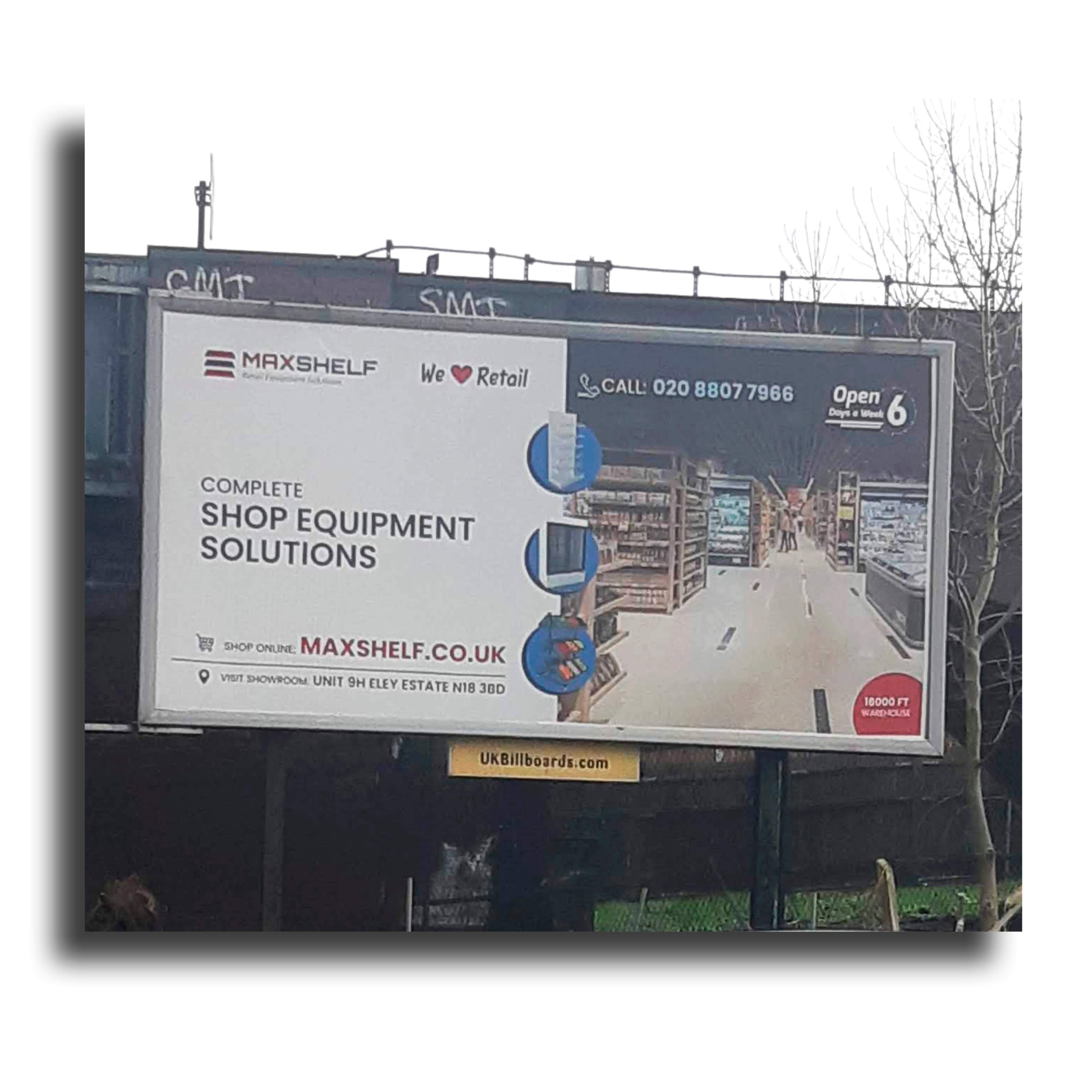
OOH posters - now with everything including the kitchen sink.
Simplicity and clarity are words you don't associate with today's posters.
Want a twenty-word headline? No probs. Love lots of fonts and icons? Of course! Phone number? Web address? Location address? You can have it. There's loads of room! This poster malarkey is a piece of piss.
And why do they put a raft of T&Cs on the poster? That's the equivalent of putting a lamb chop on a pizza.
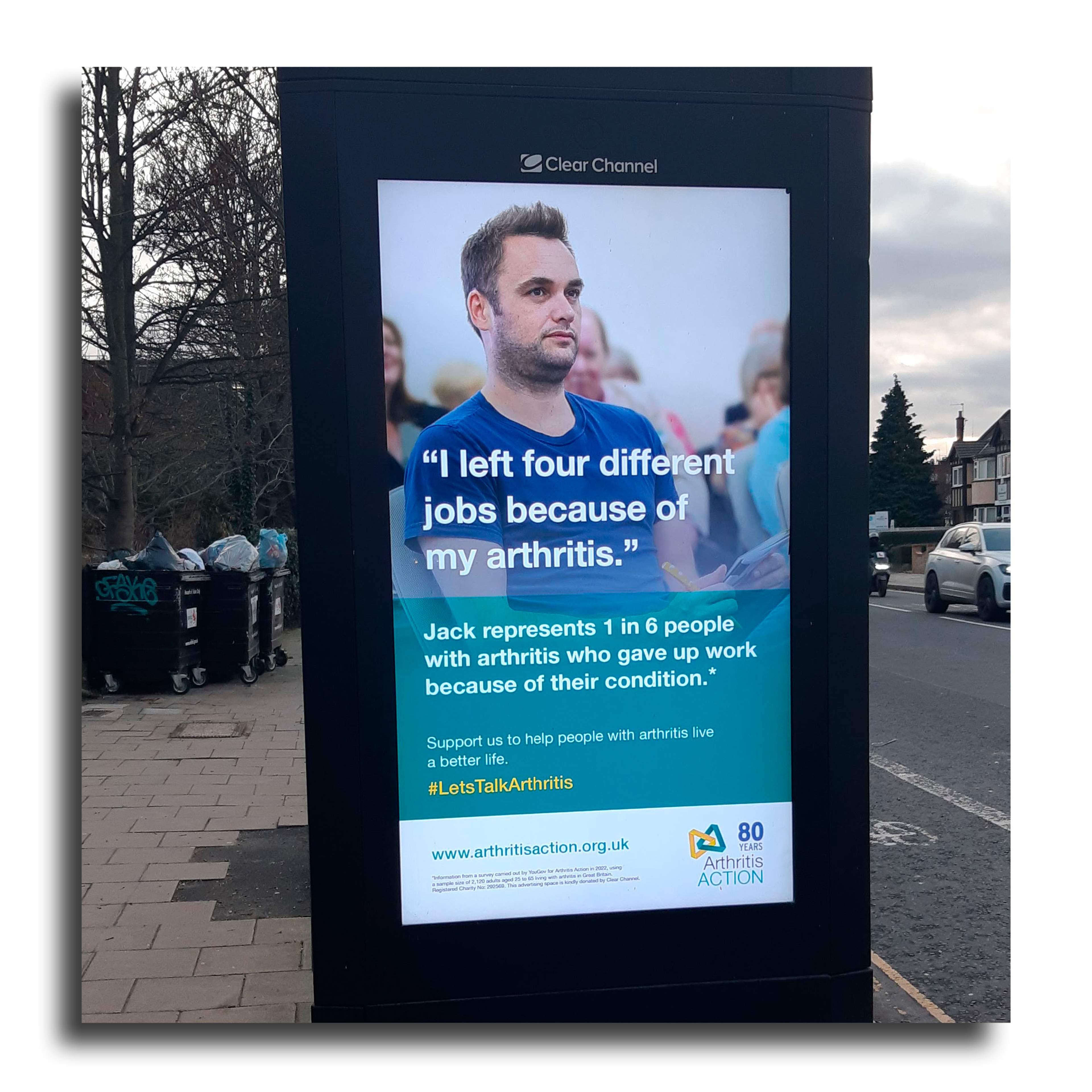
The above poster for arthritisaction.org.uk is beside a busy north London road.
I defy anyone to understand its message within 3 seconds. Look closely and there's even an asterisk in the subhead relating to minuscule copy at the bottom that even an ant couldn't read.
Even worse, this is a digital poster that is rotated with other posters within seconds, so there's even less time to figure out what the hell is going on.
Lack of thought, waste of money.
Why can't people think a little harder about their posters? Maybe OOH should be renamed OOT - Out Of Thinking.
OOH advertising. Why does it seem OOH so hard?
The creators of out of home posters seem to have forgotten that posters are out of the home.
When you're out and about, you've got many things on your mind, such as getting the kids to school on time or whether Waitrose has any avocados.
Everyday life is filled with junk flashing by, so a dull or confusing message will be lost in the mayhem.
A single-minded message has a chance to cut through all the bedlam. But being single-minded is hard.
It helps to have a clear brief to begin with, which may be part of today's problem. Perhaps there aren't any clear briefs behind all these posters. Or there aren't any clear thinkers writing them.
It's hard to hone a brief down to a few words or a simple visual, but it will do wonders for the ad brain.
A good trick is to imagine a brief as a poster. It focusses the mind, and the brief, beautifully.
In poster advertising, brevity is key. So is being unexpected.
In this era of the so-called short attention span when everyone wants you to be short and to the point, you'd think posters would be, you know, short and to the point.
But no.
Instead, we have a brief written out on a poster. Sometimes a detailed brief. And, at times, it's verbatim. There is no joy in being lectured to.
There's also no joy in being treated as an idiot. Give us something unexpected to think about. Our brains can work out ideas within a nanosecond.
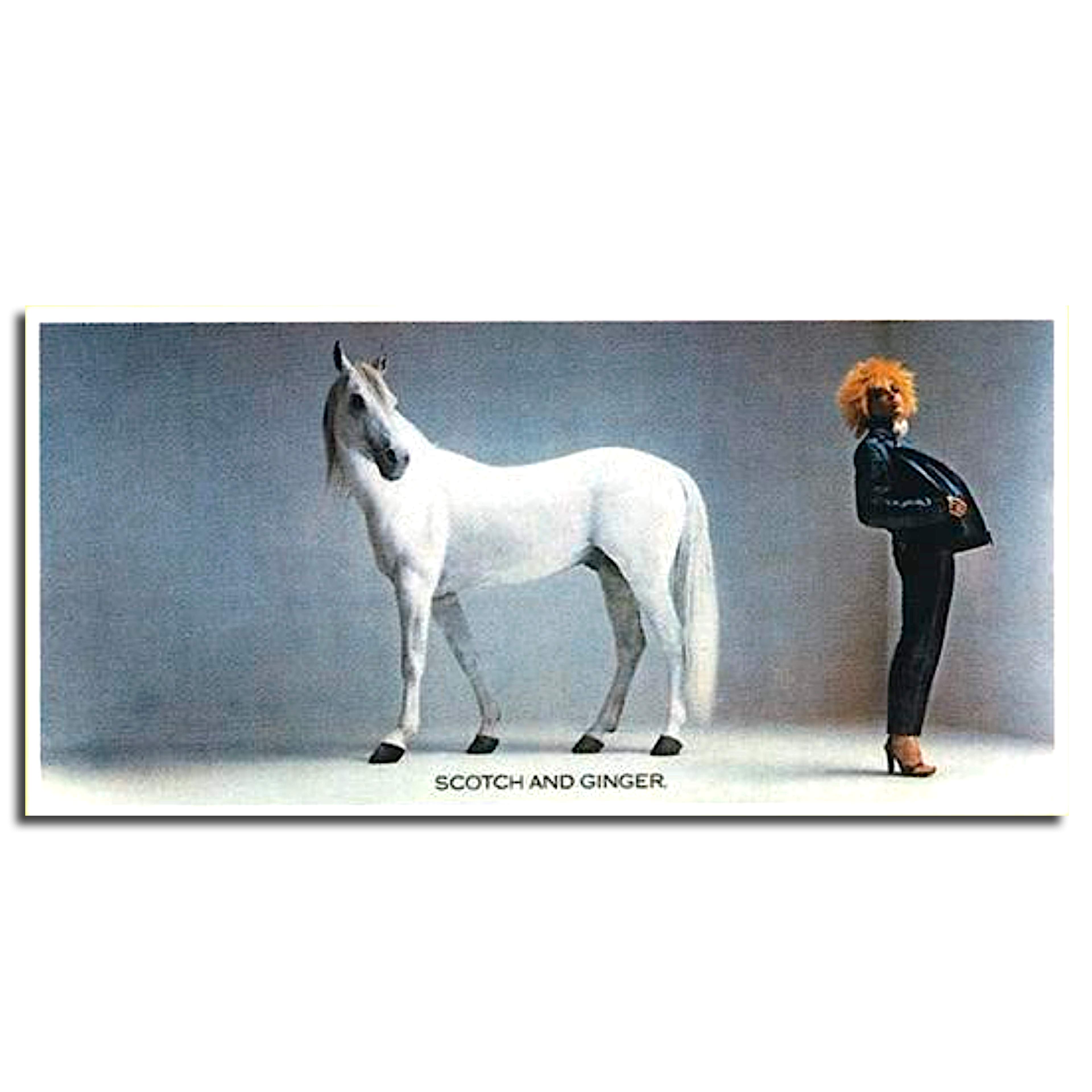
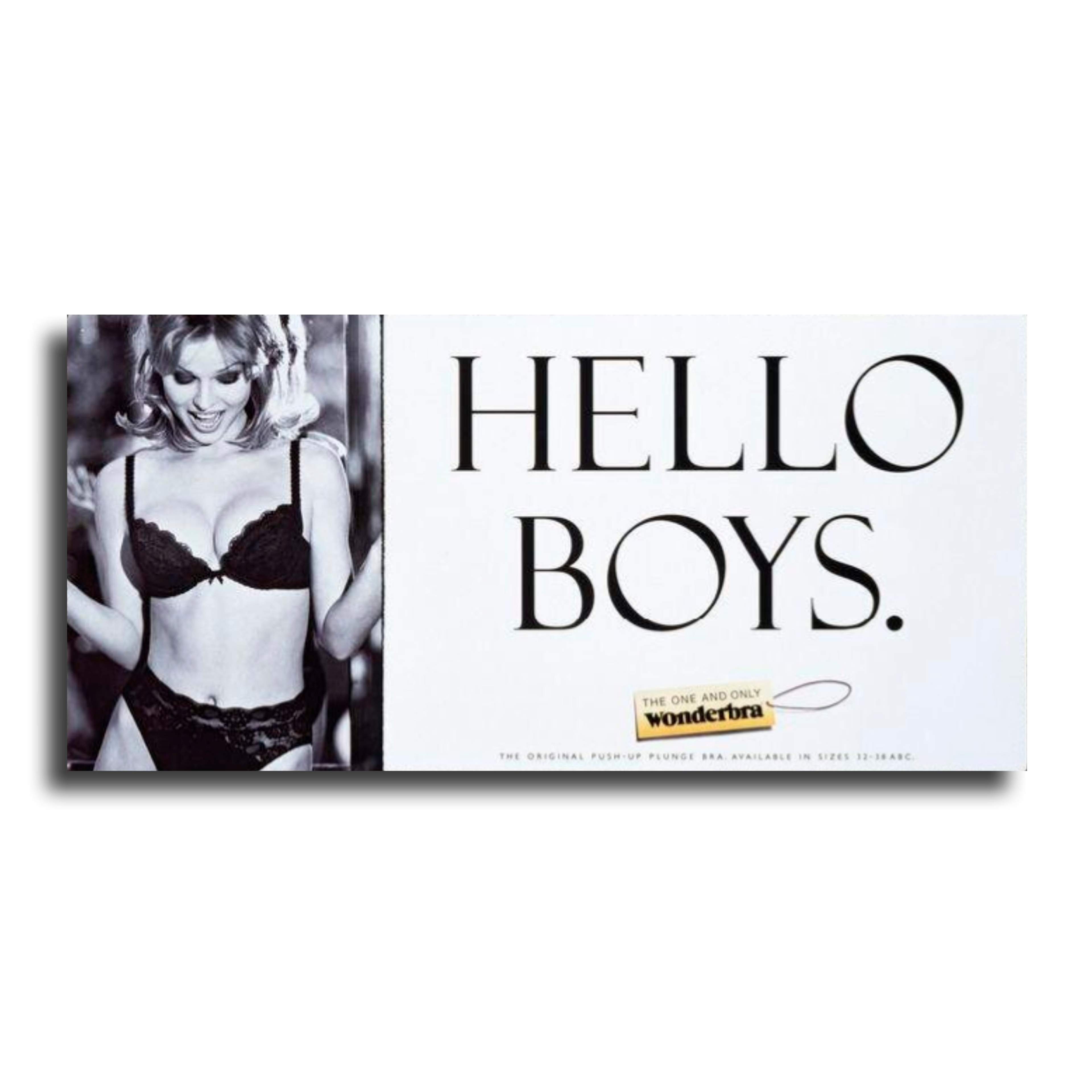
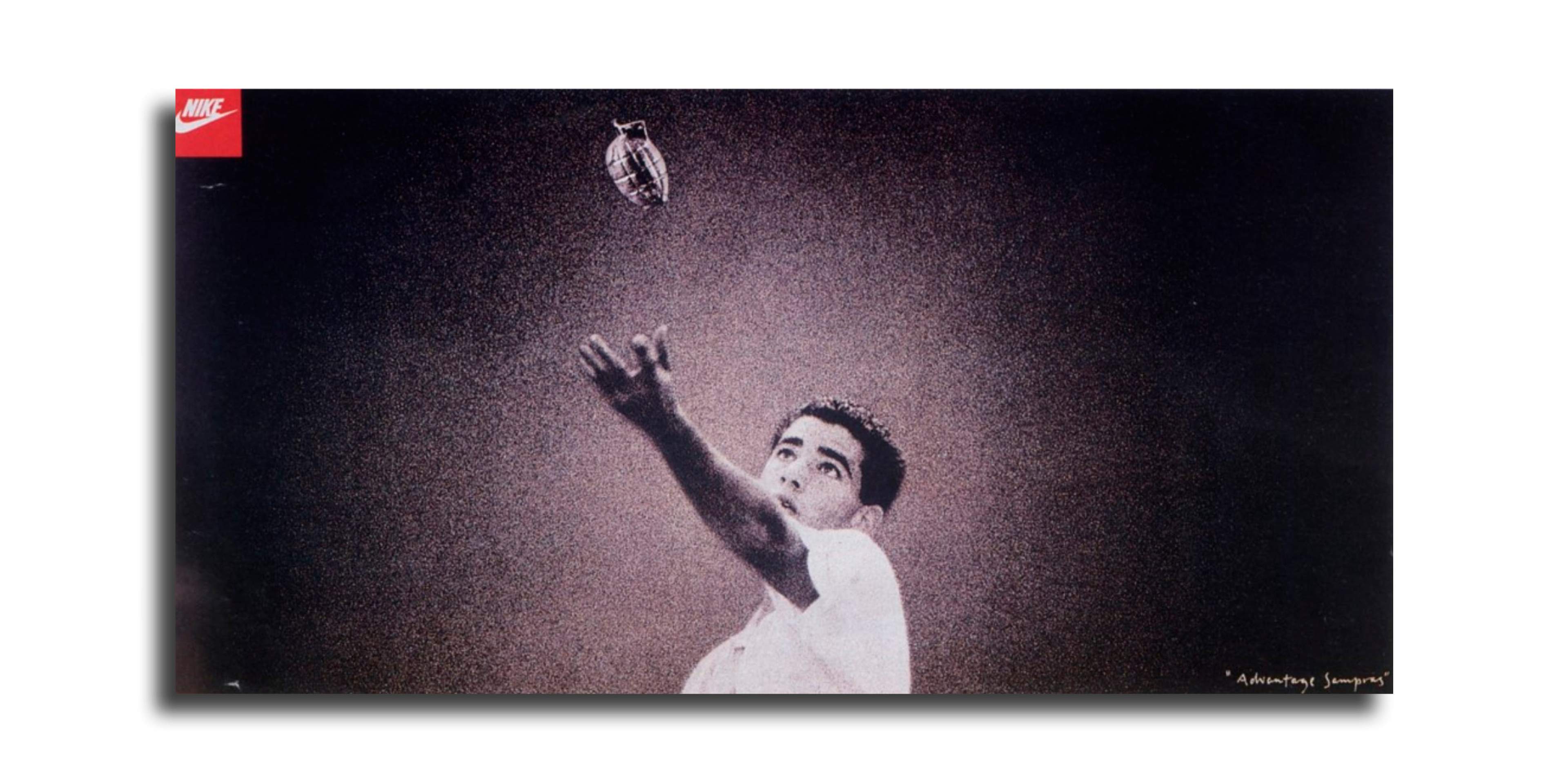
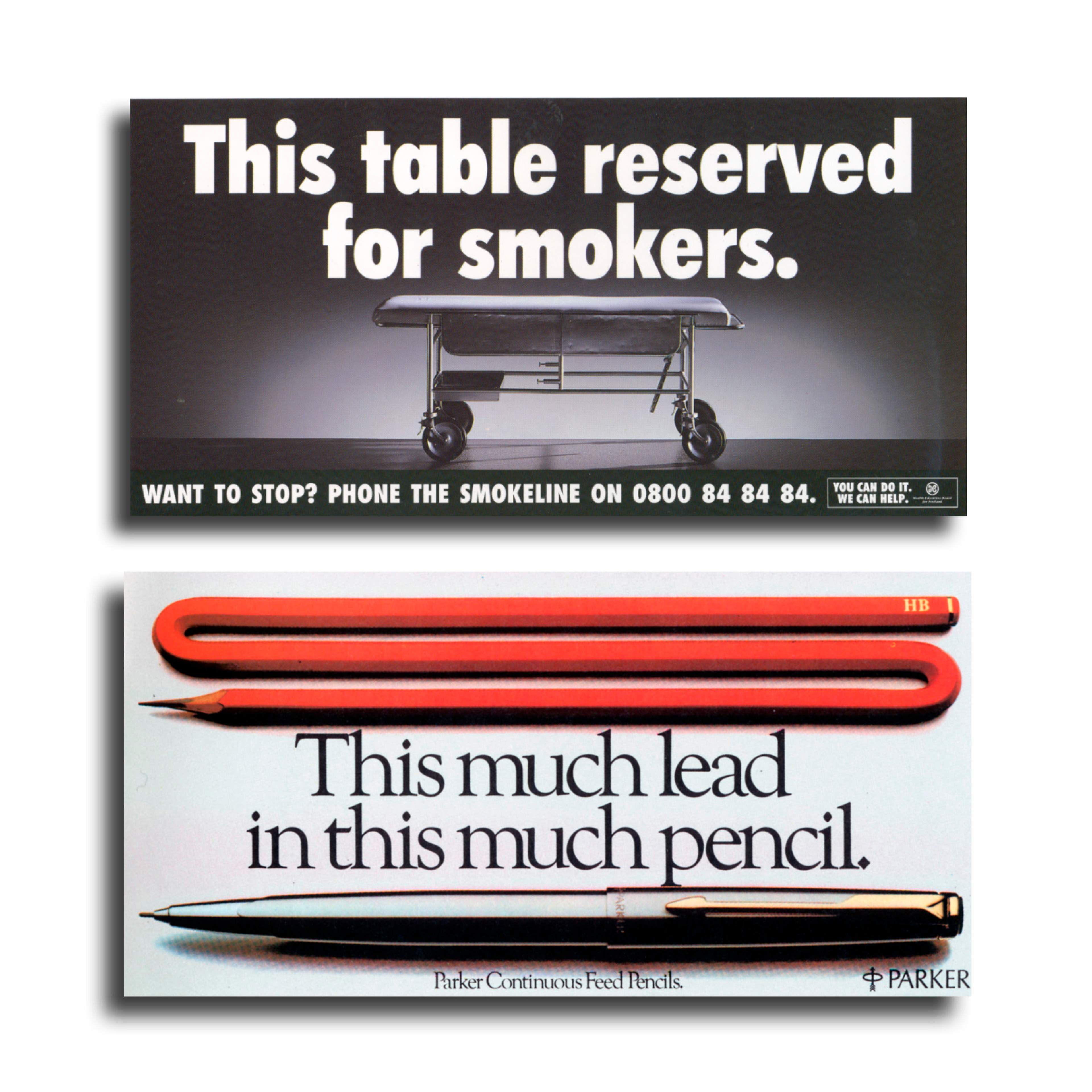
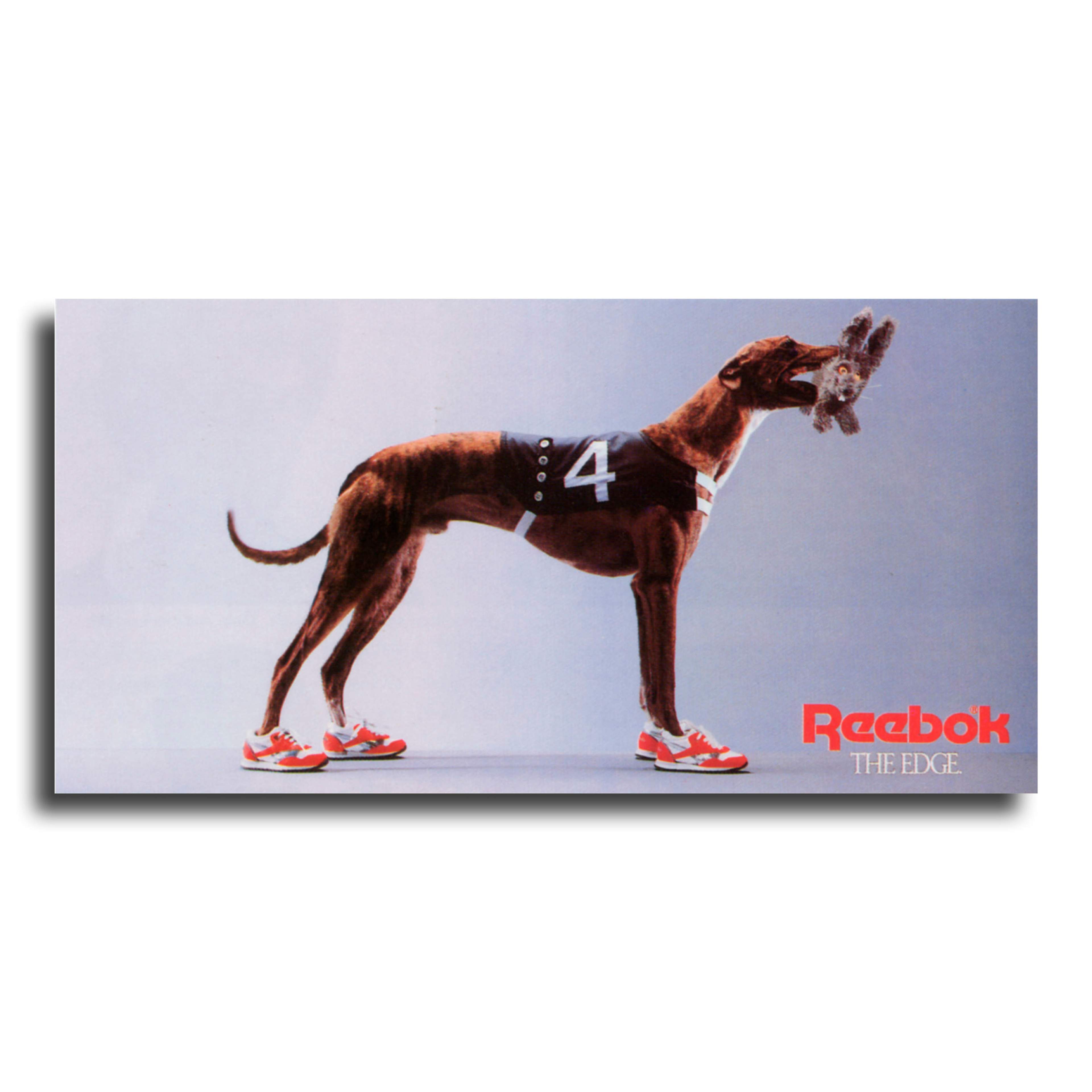
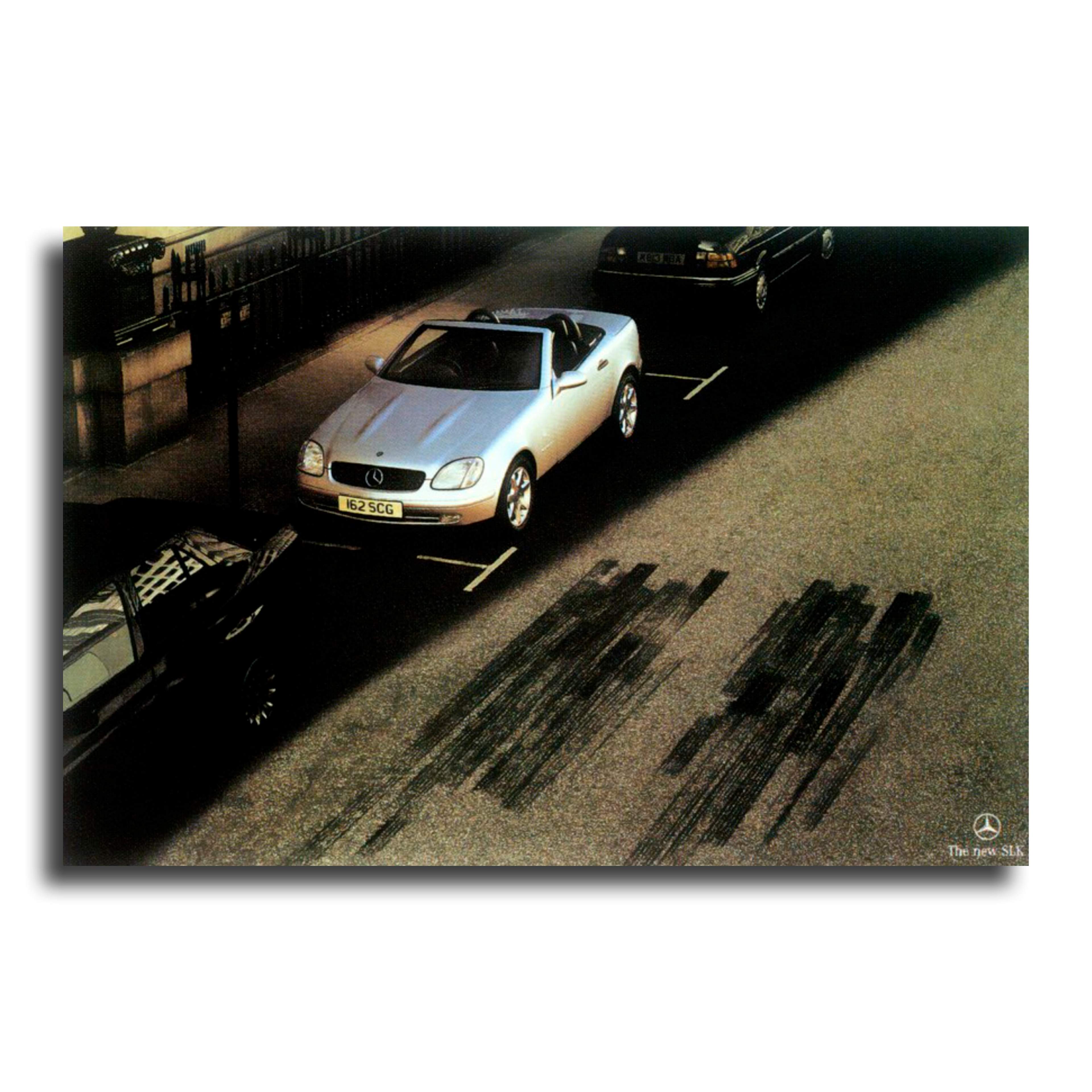
And when we do, we might like you and remember you. Like these, for example.
OOH - the antidote to the online onslaught.
You can't block an ad while strolling to Sainsbury's - sometimes I wish I could - but you can online. We're bombarded online by thousands of messages every day and people are becoming banner-blind.
To compound the advertisers' misery, in 2018 over 12 million people in the UK used ad blockers. Of those aged between 18 and 24, 43% decided they had enough of this intrusion and irritating nonsense and stumped up for ad blockers. And it's a growing problem.
If your target market ignores you online, how about selling yourself out of the home? The rise of the ad blocker could make way for the rise of the poster.
Oh, the joy of OHH advertising!
There's hope.
Outsmart, the trade body for the Out Of Home advertising industry reported advertising revenue for the third quarter of 2022 was £306 million, up 13% on the same period last year.
Posters are a refreshing change to online advertising. Clients like them too. You drive or walk past them repeatedly so they offer constant brand visibility and improved exposure.
They're also cheaper and longer-lasting. Even better news for clients.
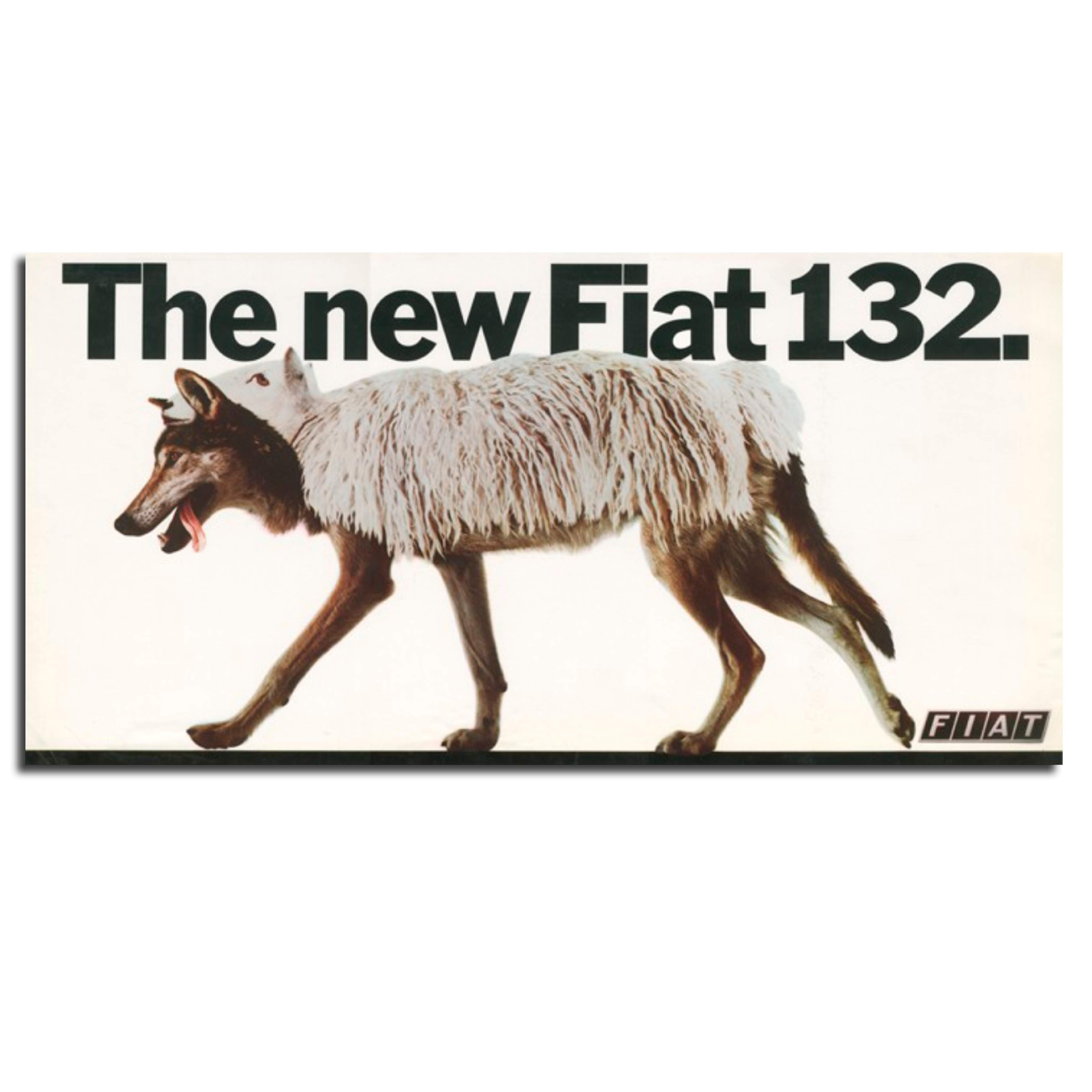
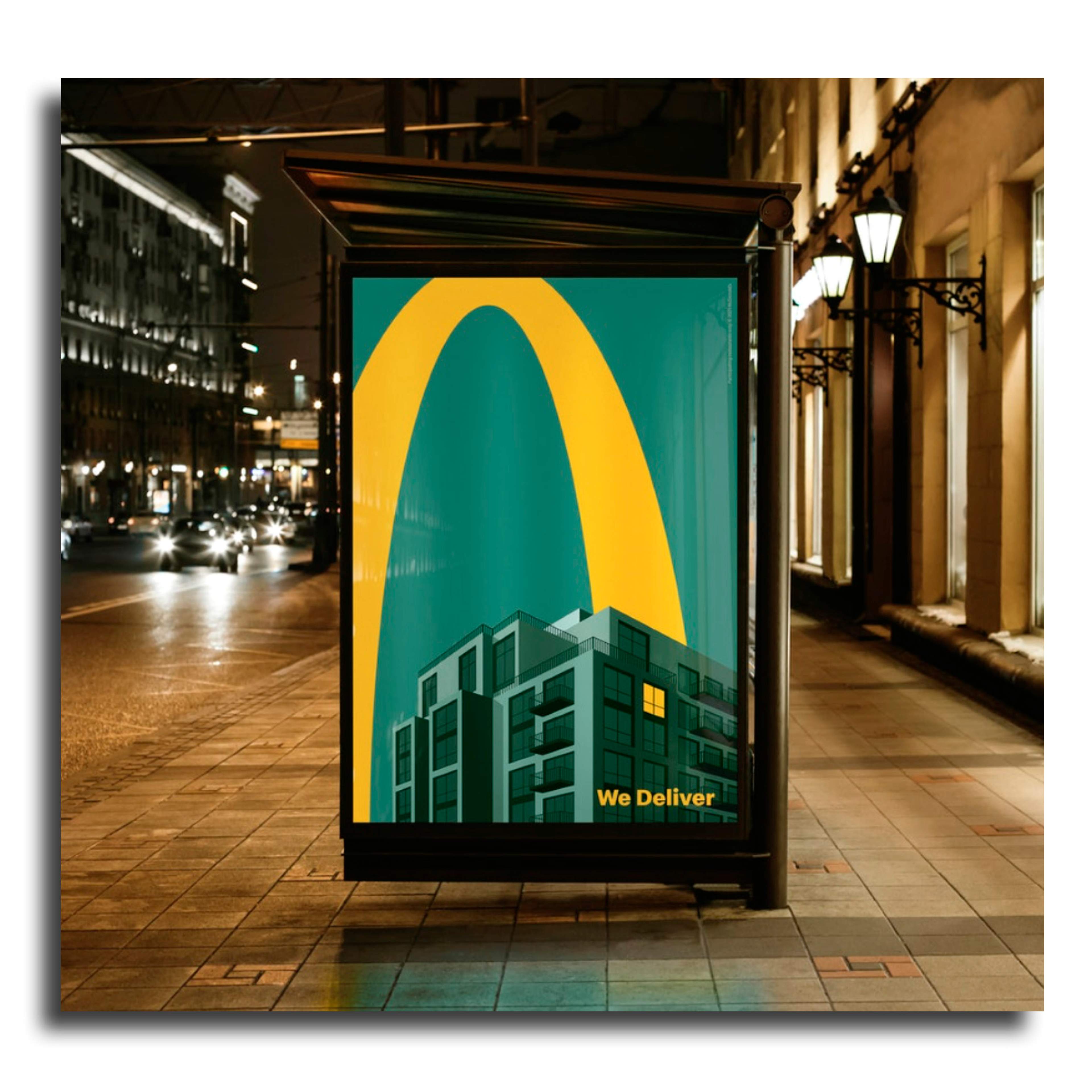
Some clients realise the creativity and brand awareness OOH offers. And some big brands know how to use them well.
One of the biggest spenders on OOH is McDonald's and it shows how OOH should be done.
DOOH advertising - moving in the right direction.
Digital out of home advertising is more expensive but still effective.
Also, there's a direct link between outdoor activity and smartphone interaction that can be exploited, so adding to the customer's journey.
Burger King in Buenos Aires used a neat bit of technological wizardry to create their Whopper Heist campaign. People were able to 'steal' a Whopper from the digital poster and save it on their phone which they redeemed at their local Burger King.
While the British Airways 'Look up' campaign captured live data of a plane flying overhead and had the added charm of a child pointing to the plane as it flew over in real time.
Admittedly, these are a bit tricksy but the idea to use technology to engage people is interesting. I'm sure some other bright sparks in the future will come up with some other pieces of fancy-pants trickery.
You may think that all these OOH posters only add to the number of ads we're exposed to.
Yet if they're smart and engaging, they'll be remembered for all the right reasons. And that's what every client wants from their advertising.
If you're a client maybe these thoughts might encourage you to be brave and single-minded. And if you're a creative maybe they'll encourage you to challenge the brief and become famous.
I hope all this has whetted your appetite. Feeling peckish?
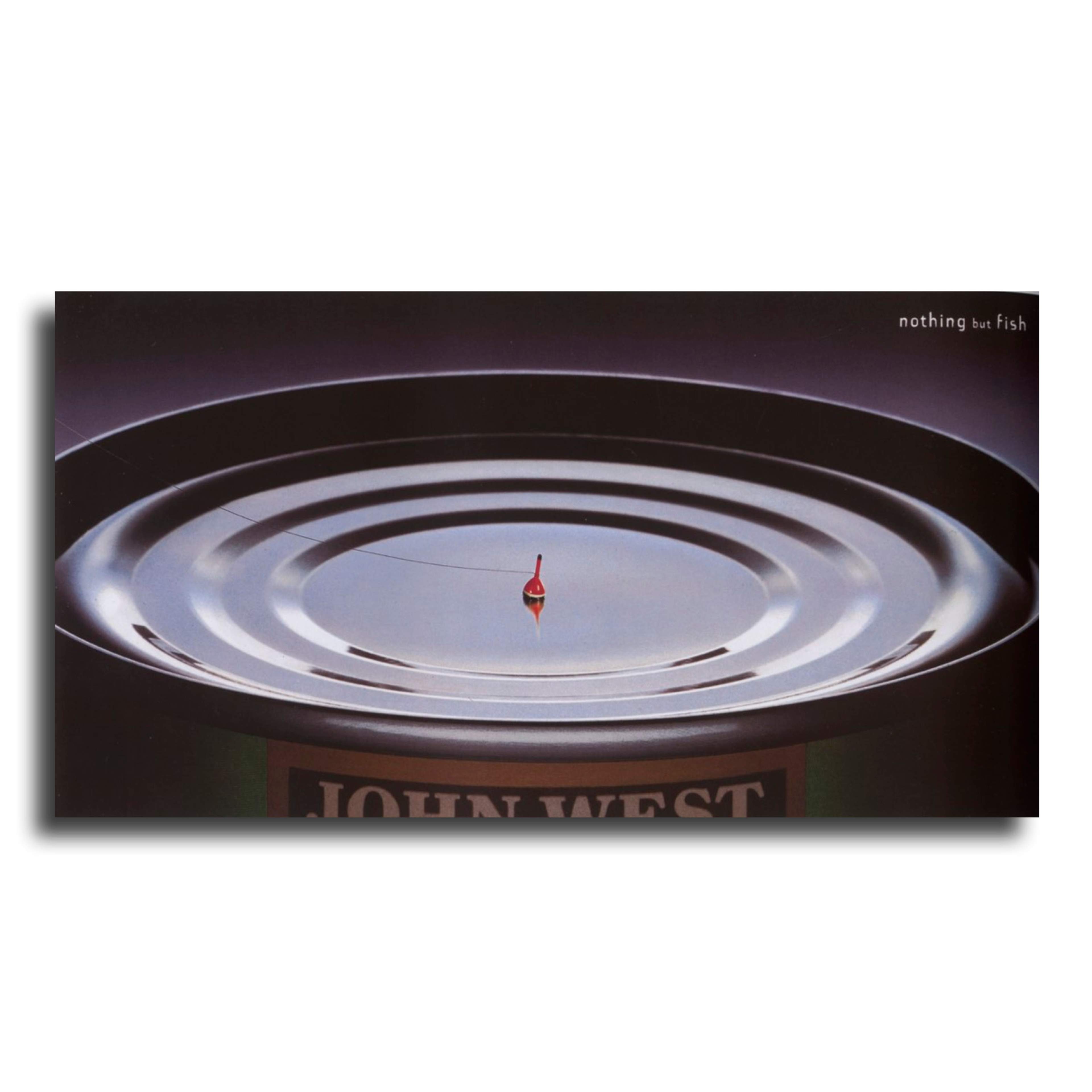
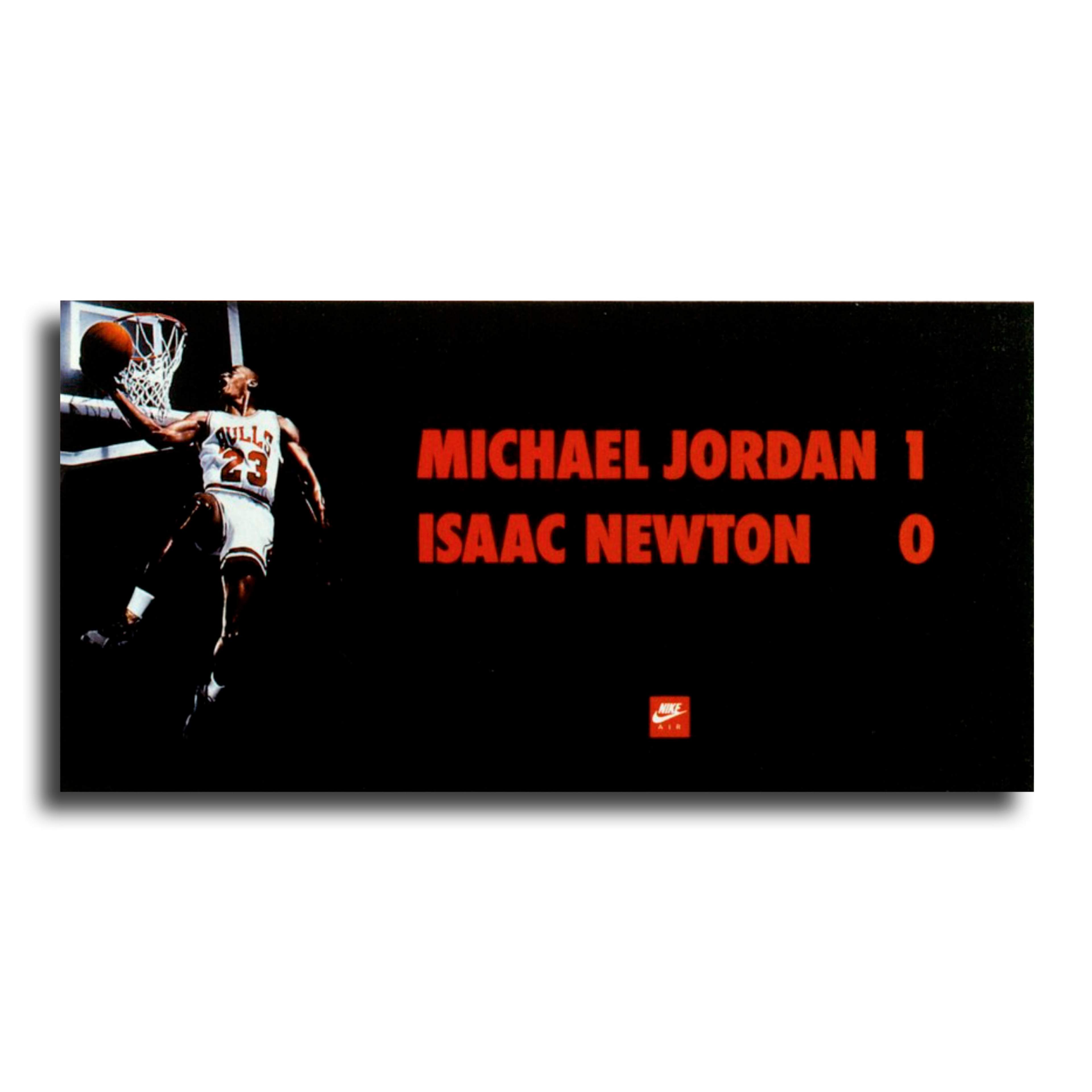
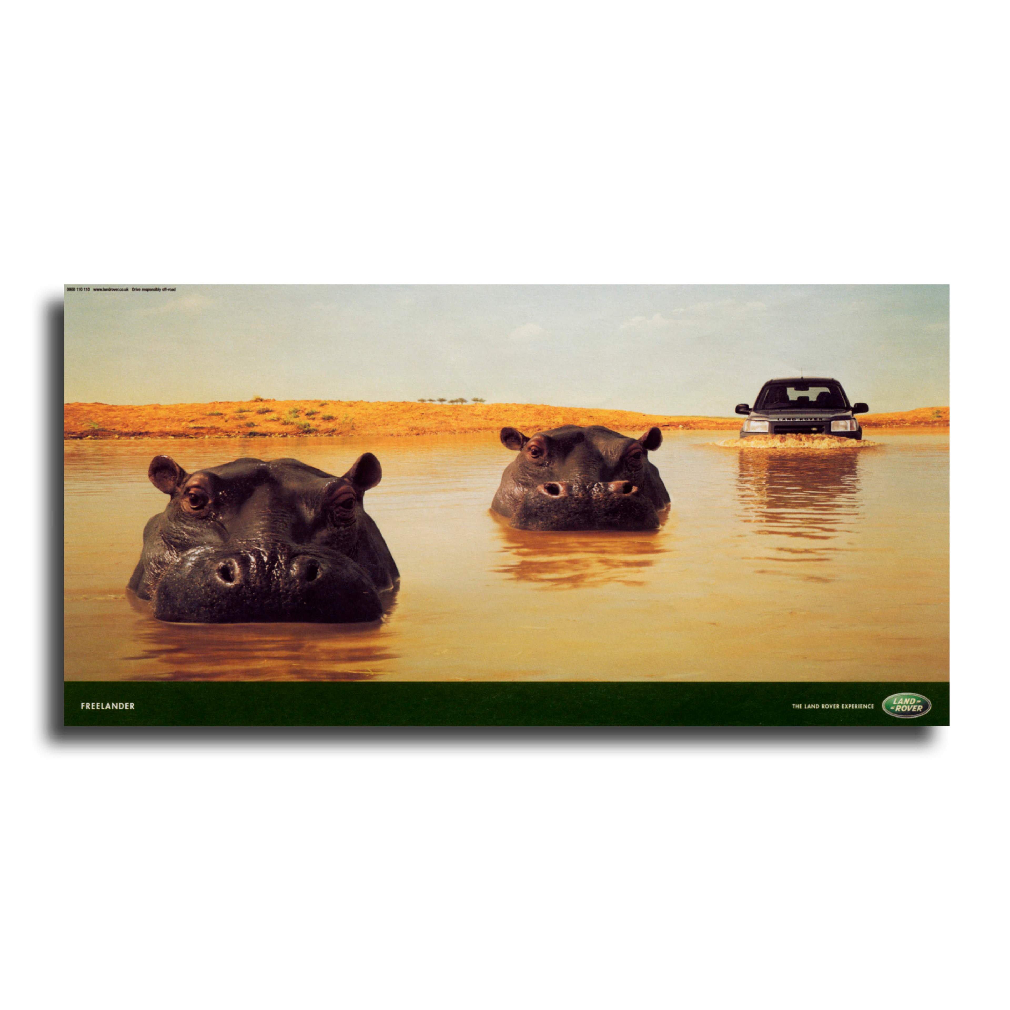
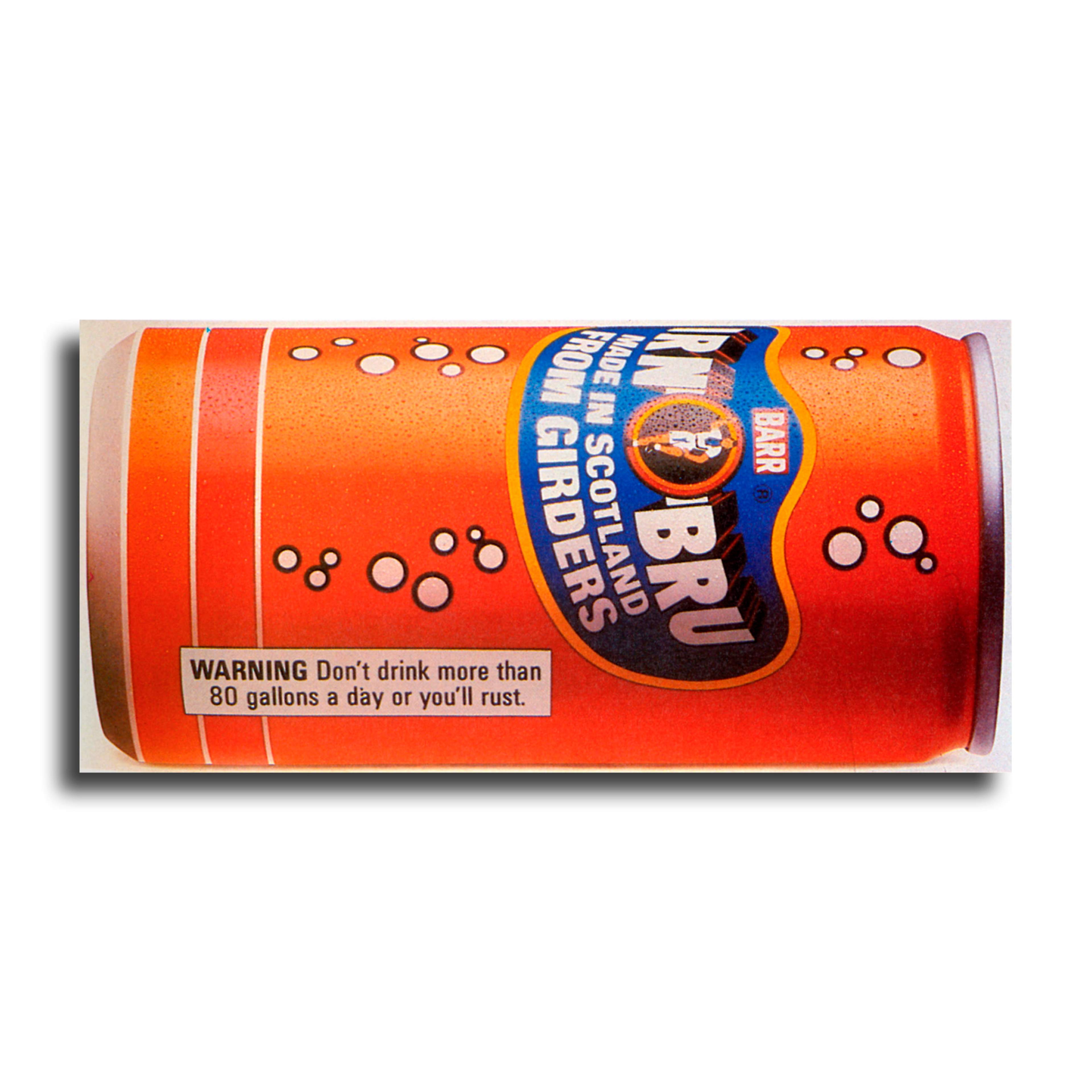
Here are some beautifully simple pizzas.